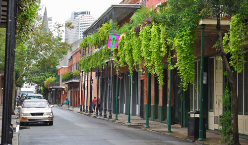
I just got back from a few days in New Orleans, where I stayed—as most tourists to that city do—in the French Quarter. The name is actually a misnomer from the particular perspective of an urban planner: most of the historic architecture in the French quarter dates to a period of Spanish rule from 1763-1801, and much of the urban design suggests a strong Spanish influence.
The French Quarter is one of the North American continent’s most treasured tourist destinations. Tennessee Williams once said, “America has only three cities: New York, San Francisco, and New Orleans. Everywhere else is Cleveland.” (Apologies to Cleveland, which I hear rocks.) The Quarter, to many visitors, feels as impeccably master-designed and curated as Disneyland. This perception is understandable but wrong.

It brings me to something I find North Americans in particular need to remind ourselves of. We’re accustomed to environments built at the scale of the automobile, and to places where everything about the buildings suggests impermanence. When we vacation somewhere like the French Quarter, many of us slip into the false belief that a place like this—oriented to the pedestrian, with lavish attention to detail in public spaces and an overwhelming sense of place—is by necessity a tourist destination. It’s a novelty. You visit it, you love it, but who would ever try to replicate it in the places we go about our everyday lives? Impractical, surely. Too expensive, surely. Pretentious, even.
That view says so much about where we’ve gone wrong in how we build—and maintain—our places.
Is This a Place for Tourists? Was It?
The name for the quarter in French, Vieux Carré, just means “old square.” These 78 blocks were nothing more or less than the original city, before anything else existed around it.
The stuff in the French Quarter is of course extremely tourist-oriented. There are dozens of antique shops and galleries but no grocery store. There are bars aplenty, but a library is harder to come by. Relatively few people actually live there—you’d have to meet a lot of your practical needs outside the neighborhood if you did.
But the placemaking, the urban design, is a tremendous part of the appeal, and let’s take a minute to appreciate the development pattern itself, irrespective of what’s occupying those buildings:
The most striking thing about the French Quarter is its immediate legibility and sense of place. On our Strong Towns Strength Test, Question #2 is “If the revolution came to your city, would people intuitively know where to gather?” In the French Quarter, the focal point is Jackson Square. This central plaza faces the dramatic St. Louis Cathedral, and lies on the Quarter’s axis of symmetry. A grid of streets extends out from it, on which everything is profoundly human scale.
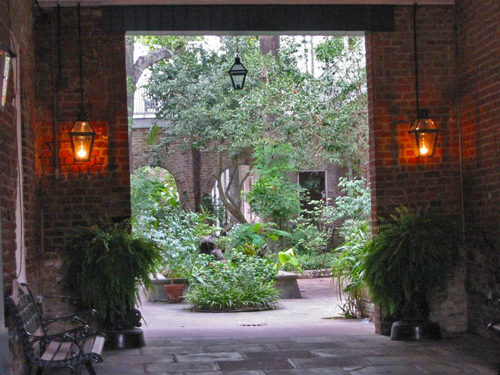
The narrowness of the streets guarantees a sense of enclosure (like an outdoor living room) and plentiful shade in 90° summer heat. Balconies are ubiquitous and an extension of the public space—on a narrow street, you’re close enough to hold a conversation with a person on a second-floor balcony. A sense of wonder and discovery is nearly constant: mysterious alcoves open up into stunning hidden courtyards.
Because most of the people on the street are tourists, the famed social complexity of Jane Jacobs’s “sidewalk ballet” might not be there, but you do encounter the kind of public characters she wrote memorably about in The Death and Life of Great American Cities—and if most of them are in some way in the business of making money off your presence, this is because tourism is the prevailing industry, not because their presence is a gimmick to begin with.
This is a place that is delightful to simply be without doing much of anything. Now imagine it filled not with alligator tchotchkes and lethally-sweet frozen daiquiris, but the stuff of your day to day life.
Picture the places you would need to go in a typical month or two: corner grocery stores, doctors’ offices, banks—occupying the storefronts that now have signs like “ANTIQUE GUNS AND SWORDS.” Put apartments on the second and third stories instead of hotel rooms. What’s now the dining patio of a large restaurant, imagine as a playground or dog park for the recreational needs of our two- or four-legged children. Imagine a decent chance of spontaneously running into a neighbor while walking home with your kid whom you just picked up from school—a walk on which you stop for milk and toilet paper and pick up a prescription along the way.
This isn’t an impractical fantasy. In fact, it’s how much of the world has always built cities. And it’s how North Americans used to.
A Timeless Template
Something clicked into focus for me the first time I visited New Orleans when I saw the sign at Jackson Square indicating its name under the 40 years of Spanish rule: Plaza de Armas. That phrase will be familiar if you’ve spent much time in Latin America. Virtually every city has a Plaza de Armas at its center: a public town square, flanked by the city’s most significant (often public) buildings and its most valuable land.
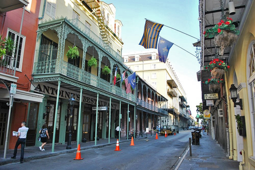
Latin American urban design owes its uniformity to the Law of the Indies, the code governing the administration of Spain’s colonial settlements in the 17th and 18th centuries. The Law of the Indies laid out a city-building template that was practical and almost infinitely malleable, despite its seemingly rigid rules. Cities were laid out on a grid of square blocks, but always askew to the cardinal directions, for a very practical reason: in hot climates, this means that at least one side of every street will always be in the shade. Streets are narrow, also because of the heat (as well as the inherent psychological comfort of the human scale).
This template is hugely adaptable. You can put just about anything in the buildings that the market supports or the community’s needs demand. The importance of incorporating public space into the city plan in the form of squares or plazas is that it creates permanent anchors that sustain the value of a location and encourage local wealth creation. A central square ensures there’s some there there—something private developers want to be near. It also serves the function of wayfinding: locals and tourists alike can measure their location in blocks east, west, north, or south of the square. (This is the best way to never get lost in the French Quarter—the endless booze-fueled party of Bourbon Street provides a secondary navigational anchor, of course.)
It’s brilliant, and that’s why you see the same features again and again in places planned according to the Law of the Indies or influenced by it. In the US, this pattern is evident not only in New Orleans but also Mobile, Alabama; Pensacola, Florida; Santa Fe, New Mexico; even downtown Los Angeles. Nearly all major Spanish-founded American cities have a centro historico that reflects the Law of the Indies. Guatemala City, Lima, Quito: the list goes on and on and on.
And here’s the thing: most of the places with this urban form are intensely lived-in places—living proof that we could have much of what is beloved about the French Quarter not just as a magical vacation getaway, but as the backdrop for quotidian life.
A Platform for Incremental Wealth Building
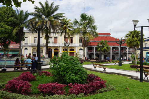
You don’t get to the opulence of the French Quarter overnight, of course. Here’s the Plaza de Armas in Puerto Maldonado, Peru, a fairly impoverished town in the Amazon rainforest:
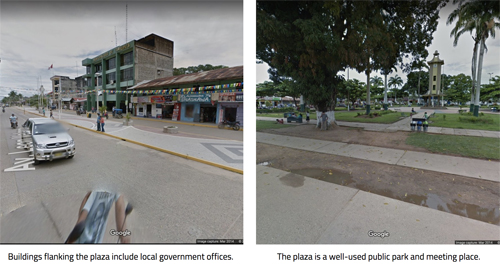
This is the no-frills version. These buildings are the cheapest buildings it’s possible to construct. If their owners are successful, they can make improvements over time—an addition, a balcony, a more attractive facade. Add a little more incremental wealth building, and you get Iquitos, the cultural and economic hub of the Peruvian Amazon:
Here’s the Plaza de Armas in Peru’s capital city of Lima:
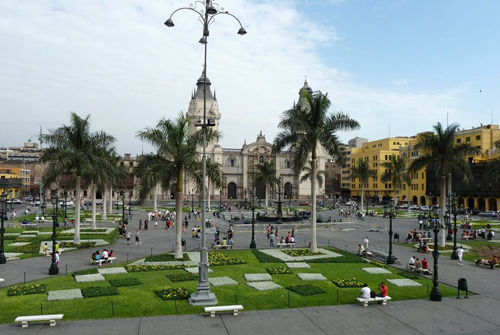
The key is that as a city grows and matures, the plaza stays the center of town and the anchor of community prosperity. Other neighborhoods often develop their own central squares or parks that serve as similar but more locally-oriented focal points, in what Leon Krier calls expansion by duplication.
All of these follow the same basic design template as Jackson Square and the surrounding streets of the French Quarter. I have to imagine that if you’re a tourist to New Orleans from Arequipa, Peru, or Morelia, Mexico, your experience of the urban design isn’t one of startling discovery but comforting familiarity. (The world-class New Orleans food and music are probably just as magical as they are for us gringos, though!)
We do have examples of this kind of ingeniously replicable, adaptable grid plan oriented around public space in the Anglo-Saxon planning tradition, too. Center City Philadelphia is built around public squares—and is a tremendously durable and financially productive place. Savannah, Georgia is famously built around public squares flanked by narrow, shady streets, and has prospered as a tourist destination.
What We’ve Lost—but Could Rediscover
Sadly more common, though, is the story of Savannah’s cousin down the road, Brunswick, Georgia, which had a similar founding plan but hasn’t been as well preserved and doesn’t draw tourists the way Savannah does. Brunswick suffers a lot of abandonment and decline. The bones are there, but we have let the body languish.
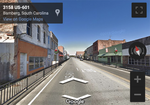
Even more so than larger cities, thousands of small towns all over America have walkable centers designed by copying a timeless template—a central courthouse square, maybe, or a main street of small storefronts with apartments on top. Many of them have been economically hollowed out and depopulated, but a drive through them with an eye out for this template reveals what we’ve lost. Imagine this scene, from Bamberg, South Carolina, bustling with people and businesses (and with those awkward railings removed and the stroad calmed).
I feel a sense of mourning, when I see things like this, for the places we once had here in the U.S. It’s analogous to the stories you hear about how abundant wild nature used to be a century ago: “The skies would sometimes darken with flocks of birds. You could catch salmon in the streams with your bare hands.”
There’s something I think more of us than not genuinely do crave about a traditionally-developed city built at a human scale. James Kunstler famously observed that Disney theme parks more or less replicate this pattern. So do college campuses and, in their own way, malls.
And of course, countless millions vacation every year in New Orleans and Savannah and Charleston and Santa Fe and so forth. But these places’ historic districts represent a pattern of building that we’ve made so scarce that it is now mostly reserved for tourists, and the very wealthy who can live in such unique neighborhoods. In the vast majority of the places that used to be this way, we’ve torn down half or more of the buildings for parking lots, lost others to disuse, hollowed out the economy in the name of pop-up strip-mall growth on the edge of town.
It doesn’t have to be that way. Visit the French Quarter and marvel at it because it’s the exception. But walk away from it wondering why it isn’t the rule.
This column was originally published here.
The mission of Strong Towns is to support a model of growth that allows America’s cities, towns and neighborhoods to become financially strong and resilient.
The American approach to growth is causing economic stagnation and decline. It has made America’s cities financially insolvent, unable to pay even the maintenance costs of their basic infrastructure. A new approach that accounts for the full cost of growth is needed.
Strong Towns on the web
Strong Towns on Facebook
Strong Towns on Twitter